13 Sept 2012

Package Design

Our brief was to create package design for a new range of 'flavoursome' fruit juices. I decided to do the front and back of the carton as this contains the main logo, juice name and some form of institutional information.

To begin I drew up some iconography such as various fruits. I also tried drawing lots of different style typefaces. I drew all of these drawings on a very small scale in the hope to enlarge them later in Photoshop, as this would bring out any of the imperfections or 'slips of the pen', adding a hand drawn element to the design.

Another reason why I drew multiple types/ designs of fruit was that I aimed to put it into some form of pattern later on, for either the whole packaging or just an element of it.

Original fine liner drawings
I then tried some 'scratchy' drawings using a fineliner, and then applied colour in Photoshop. 

I then tried developing a pattern in Photoshop


The problem with the 'scratchy' drawings was that the black outlining looked very dark, and not fresh (as fruit should be seen). Because the product was fruit juice I refined this idea, stripping away the black outlines, leaving a very clean and minimalistic image that was more appropriate. 

I also experimented with paint splashes and different typography, refining the images I created originally until I came to my finished design. I also added a website, weight and recycling symbol to remain better in-keeping with pre-existing packaging found in the shops today.

Finished package design

12 Sept 2012

Sketchbook Manual

After making our sketchbooks we then made a manual to instruct others on how to do the same. 

It is in an portrait accordion format with a colour scheme of black and white and one other single colour. I chose to use red because it is a bold yet versatile colour, and then throughout the manual I just used different variations of this red. 


Original ink work


First we drew out all the text and images for the manual in a light crayon. Then, I used either black ink with a brush, black ink using a quill or a black fine liner to go over the original drawings; I swapped between techniques depending on the size and detail of the sketches.  


It wasn't vital that all the lines were perfect in the sketches because once they had been scanned in they could be altered. Also, any imperfections, such as shaky lines, just created a different, more unique effect. 

Photoshop

After scanning in the inked images I began constructing the manual on photoshop, arranging the pages and altering things such as the size, rotation and colour. 


This is the lasso tool which enables you to select various shapes and crop and re-arrange text and images on the page.


This is the crop tool which enables you to manipulate images/text and remove any unwanted parts.


This is a brush tool which you can colour images/text with. The brushes vary in thickness and from paintbrushes to airbrushes, both giving different effects.


Layers

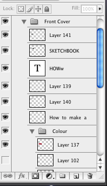
It was essential while making our manual that  each of the different pages were put on separate layers. This was so you could easily edit individual parts and hide certain things (the eye on the left indicates what's on show).

Once I moved onto adding colour to my work I made colour folders in each on the pages. You can see the colour folder for my front cover open on the left. By making a new folder it enabled me to turn off just the colour if I wanted. This would be important if you wanted both a solely black and white copy and a colour version.

By re-arranging the layers you changed which image was brought to the forground. For example if one layer is above the other then that picture will be on top of the one below.


Screen shots of work in progress


This is at the start where I had just begun placing things on the page, as you can see there is no colour yet.
Here it is more completed and the layout is beginning to form.
Finished Photoshop

Adding the colour

The point of adding the colour was to highlight certain areas of my work and make sure you are first drawn to that piece of text/image. I used some of the colour merely to enhance the image and make it more aesthetically pleasing. If you look particularly at the Begin Stitching section below you can see that the colour is just rough filled circles, as opposed to neat colour that has some form of shape, this makes it appear much more abstract.  

Page 1
Page 2 
Printed and assembled 


After I printed out both pages I guillotined it into strips (ensuring that I didn't cut off the sticking tabs) then put a thin layer of glue onto the tab stuck the strips together and in-line. To then create the accordion fold I just folded each page in alternate directions.