7 Mar 2013

Badges

In this mini task I made 4 badges with cut + paste poems

We simply cut out interesting words from newspaper articles and stuck them onto paper, then sealed them in between transparent plastic and the badge back (adding pins at the end).
I also experimented a little with font, font size and the background images.


7 Feb 2013

Zine

What is a zine?

A zine (an abbreviation of the word fanzine, or magazine; "zeen") is most commonly a small circulation publication of original or appropriated texts and images. It is produced via photocopying and bound with staples and is often in black and white.


Most zines revolve around a music scene of some sort, but others are dedicated to artwork, poetry, cartoons, editorials and short stories. Because zines do not have any sort of corporate backing, they are very rugged, individualized, and much more charismatic than larger, more popular magazines whose content is often dictated by their advertisers.


My zine


Instead of choosing a specific theme for my zine I decided base it around some of my favourite things. This made it a lot more personal to me, while hopefully also intriguing to others. 

The only real reoccurring feature within my zine is that each double page consists of a "zoomed in" image and a "zoomed out" image on a linked subject. 

Front & back cover

Front                                                                                      
The letters on the cover are supposed to be representative of those used in a scrabble game, while the word 'THINK' purposely doesn't give any indication of what is contained within the document, thus making you open it up and have a look.
Back
This is obviously themed around my love of tea, while also taking inspiration from the "Keep Calm And Carry On" posters which were originally intended to be 'morale boosting posters' during World War Two.
Inside pages

Page 1
I chose to do a bookcase as it meant I could use lots of detail and also reading is one of my hobbies.
Page 2
Here is the 'zoomed in' aspect of the book theme, a page of Jane Eyre . Both pages were done with black fine-liner pencil.                                                            
Page 3
This silhouette of a dancer in the rain was first drawn in pencil then filled in a black marker pens.
Page 4
This is actually the score for a piece of music in a film I like. I drew it up on tracing paper to give the page more visible texture. This is the 'zoomed in' part of the music themed pages, and the dancer the 'zoomed out'. 

Page 5
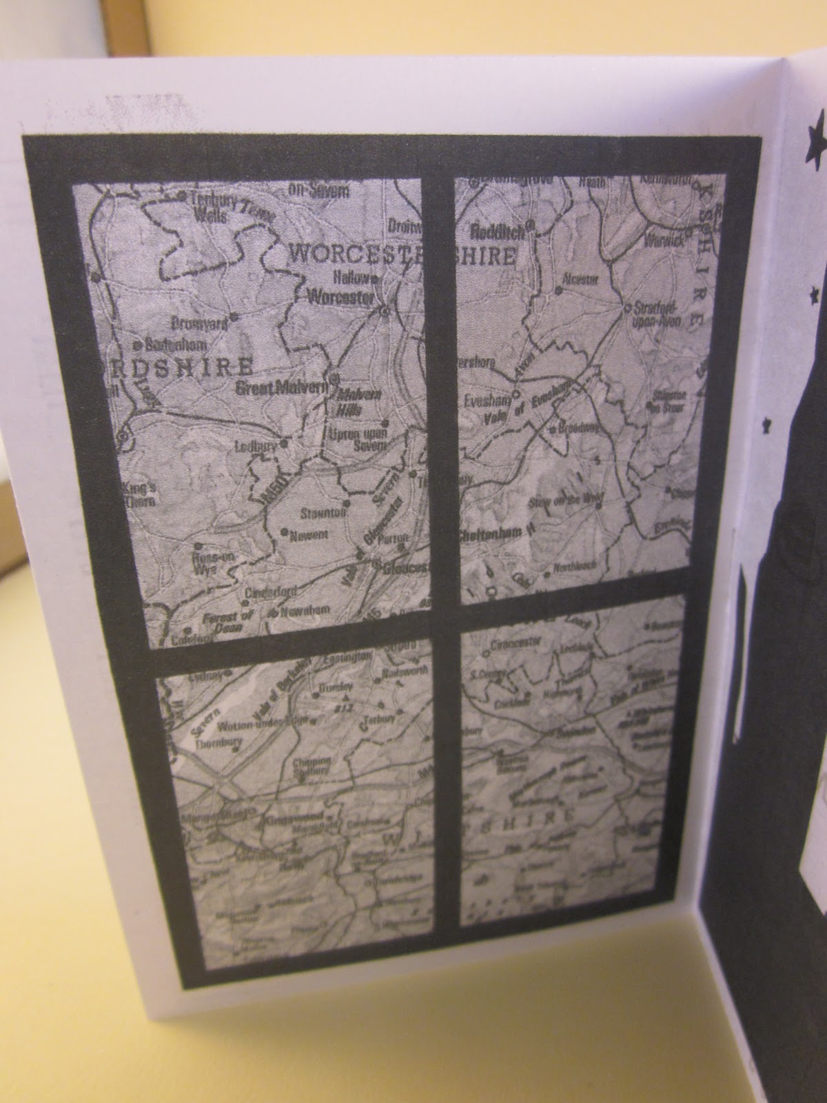
For this page I scanned in a map and then drew a window frame on the image using black fine-liners. By doing this is breaks up the image and also makes it more unique.
Page 6
This is the 'zoomed in' aspect of the travel themed pages as, unlike the map, it is focused on one particular area- New York. This is significant to me as it's always been a place I've wanted to go. 

4 Jan 2013

Making our own sketchbook

Instead of using a bought sketchbook to do our drawings in, we made one using:
  • a hardback manual 
  • thread
  • an assortment of paper
Tools we used were things such as: 
  • scalpels
  • cutting mats
  • bradawl
  • steel rule
  • a needle
The idea behind designing and making our own sketchbooks was so that the book itself was also a piece of art. It then becomes more personal and unique, while still teaching you the skills to create something practical and beneficial.

My finished sketchbook
 I used an old 70's annual for my front and back cover.
We made signatures (groups of 4 pieces of A4 folded in half) using assorted paper
such as scrap, card, envelopes and even old map pages. This will add variation to the
sketches drawn inside due to the varying backgrounds.


Here you can see the Coptic stitch I used to bind all the signatures and the covers together.


A brief history of Coptic binding

Coptic binding, named after the Copts (native Christian people in Egypt) is the earliest known bookbinding, which dates back as early as the 4th century. It began with textbooks made from papyrus or vellum sewn together with thread or thin chords.

The best known preserved example of Coptic binding:  Acts Of The Apostles which dates back to the 5th century. 


12 Dec 2012

Small Press Analysis + John Porcellino Case Study

Mini comics

Mini comics are handmade and personal comics that are often an expression of the authour's life, opinions and interests ect. They are a common inexpensive way for those who want to make their own comics on a very small budget, and are often informally distributed. Also, compared with
mainstream comics, they are only cost a small amount. Mini-comics can be very simple or very elaborately produced. A folded piece of paper that is opened like a book can be a mini-comic, and so can a 132-page die-cut rounded-corner die-cut book with a hand stamp on every other page. Despite the name, size matters not at all. Even though many mini-comics are very small, others are quite large.


Small press

This is a term often used to describe small-time publishers who usually don't publish more than 10 titles per year. Instead of being focussed on profit they tend to be more about getting the more unique books and comics seen by comsumers. Unlike most publishers they are independent and are not part of a bigger publishing house, which further shows that their motives behind publishing an author's ork is usually down to the fact they actually believe in it and like it personally, as opposed to it fitting a certain criteria or target audience.

Fanzines

A fanzine is an unoffical, unproffesional, magazine handmade by a fan of a certain theme/show/cultural phenominen, that is made for the enjoyment of others who share the same interest in whatever it may be.

Most often fanzines are distributed free of charge and the anyone who contritibuted to it recieves no financial compensation. Of course, traditionally they didn't cost a lot to produce as they were hand-drawn then simply photocopied and stapled. Sometimes they are swapped with other's at events and some even send them by post. Fanzines can be only pretty much any subject, with the themes varying from horror to punk.


John Porcellino

Porcellino was born in Chicago, in 1968, and has been writing, drawing, and publishing minicomics, comics, and graphic novels for over twenty-five years. He is best known for his self-published series King-Cat Comics, which he releases four times a year. He started them when he was just a teenager and as he has grown and developed, his subject matter and drawing style have also evolved.

John Porcellino’s comics are often described as deceptively simple: spare, childlike drawings accompanied by straightforward block-lettered text. The deception, however, is that the moments he describes in words and pictures—hearing a song on the radio, tossing bread crumbs to birds—seem small and quotidian, but are in fact both deeply personal and reflective of some larger aspect of the human experience.
Examples of a front cover of one of his issues and an inside feature:

We then made our own mini-comics inspired by Porcellino's work.

The finished piece


As you can see I imitated Porcellino's work by keeping the layout simple and using the triadic page structure. Like his front page, I did add a little more detail particularly with the trees and path.  

For the page on the left I drew up a Top 40 of my favourite songs, films, programmes and just general encounters and things. On the right I did a comic, an annecdote form when I was younger, in Porcellino's style.

On the left the comic is continued and on the right I did a guide to surviving a hurricane from when I got stuck in NewYork with Sandy. It was inspired by a feature that Porcellino did once called 'Dr Abbot's Guide To Surviving Women'. 

For this double page I did another comic and a simple one box image on the left. It has lots of white space and the text used was a quote from a poem. The whole idea of this was to just provoke thought.

This is a close up of one of the comics I did. As you can see I tried to stick to Porcellio's drawing style as much as possible so the images are simplistic with lots of line use. Even though, the finished drawings appear minimal I actually found adapting to his style quite hard and I found that a lot of planning ahead, and drafting in pencil, was needed.

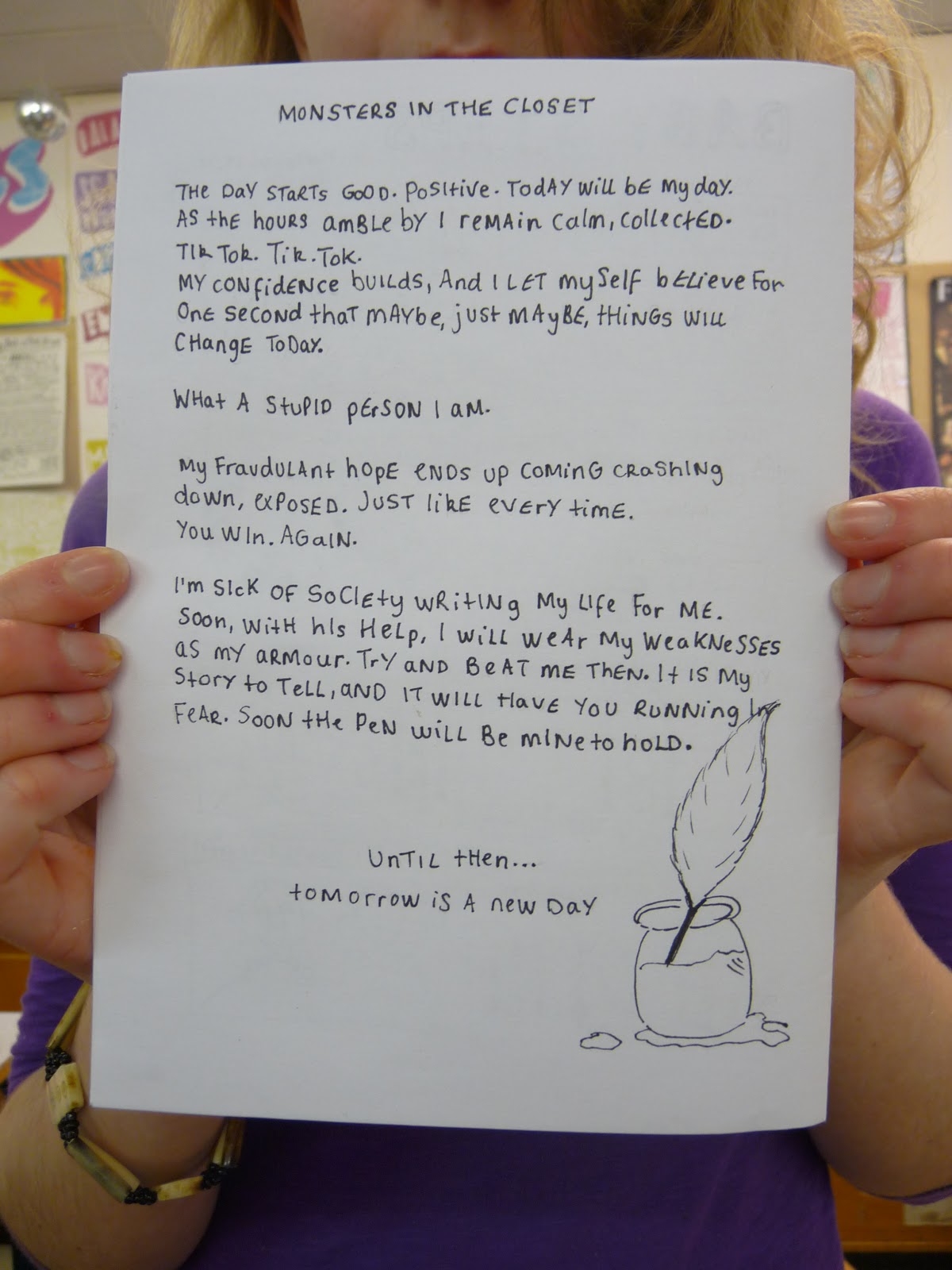
For my final page I wrote a small memoir-like piece. The biggest challenge with writing text throughout this comic was copying Porcellino's shifts between upper and lower case. At first it was very forced. but eventually it became easier to slip between upper and lower case.

Reading through each others work:


15 Nov 2012

Film Poster

Idea 1-Dirty Dancing

Film clips

Film posters


Film stills montage


Brainstorm


The Breakfast Club


Film stills montage

Brainstorm 


Lord Of The Rings Trilogy

Film clips

Sam's speech 


Film posters


Fellowship of the Ring stills montage

Two Towers stills montage 

Return Of The King stills montage

Brainstorm


Final poster

I'm going to do my posters on The Lord Of The Rings Trilogy.

Drafting and exploring possible ideas


Original idea


The 1st picture on the left is the original. I first changed the contrast to make the dark hair stand out more. Then I changed the levels and thresh-hold so I was left with the dark outline on the bottom left. From there I just cropped out the unwanted parts and then using a fill tool changed the colour.


This was my first attempt at Sam's hair, but as you can see it didn't work very well (there is too many white gaps and lines in the finished piece)

I decided to use this image instead

Once again I altered the saturation, contrast and levels .


Background

I started out with a plain beige-filled background.


I then added a pattern overlay (using a creased piece of paper) and lowered the opacity of it. I also set the blending mode to multiple so it would interact with the other layers better.


I then took an image of a map of the Middle Earth featured in the films and lowered the opacity so it was only just visible (to add extra depth)


Finished first draft on photoshop 


All of the images of the hair are set to multiple on the blend mode so you can still see the creased paper and map background through them. 

Set of 4


Instead of sticking with the one poster with all four characters hair on it I ended up creating separate ones as a set. This way the hair is more individual and more of the blank space on the poster is used. 

Frodo


Sam


Pippin


Merry