
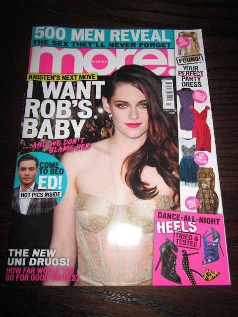
More! magazine front cover


More! a weekly women's fashion magazine that includes celebrity news, high street fashion, and sex tips. The fashion content in the magazine has an emphasis on affordable high street clothing making it more relatable to the regular females who are looking for affordable fashion.
Colour Scheme
The most prominent colours on this cover are magenta, teal, white and yellow. However, other colours are also brought in through the shoes and clothes. The pink adds femininity to the cover (as it is targeted at females) while contrasting strongly with the white, making the masthead stand out. It seems that all of the most important information is in white, for example the mast head and feature article. This has most likely been done because it stands out the most against the darker colour of the photograph’s background. Compared to the monotone colour scheme in Elle Magazine you could say it's a little trashy.
Typography
The typography on the cover is quite simplistic and the same font is used throughout (bar one occasion) giving it a feel of continuity. It is in bold sans-serif upper case font which is highly legible and eye-catching. The line “...AND WE DON’T BLAME HER” is the only different font used. This has more of a hand-written feel, like it was an add on, you could even say that it’s like something someone could say, so they are trying to relate the audience's mode of address.
While the majority of the text is plain, a stamp effect has been used for some words, almost like the 'tried and tested' stamp of approval. For example the word “FOUND!” is worn away a bit, adding variety to the page.
Layout
The hierarchy for this cover focusses less on the masthead and more on the cover photo and feature article. The text for the article is almost as big as the masthead which causes this. Also, Kristen Stewart’s head covers some of the title, giving the impression that she is more important.
Unlike in Elle, this cover doesn’t have just horizontal text. There is a multitude of angles used giving it an edgier and more dynamic feel. Also, the photo-packages used are all on the right of the cover and the texts tends to be dominant on the left. On the whole, this cover is quite busy and doesn’t contain any white space. It gives the impression that there’s lots going on and lots to see. By putting so much of the content on the cover you are more likely to draw readers in as they are more likely to see something that appeals to them. This has probably done so the magazine can compete with others of a similar price range.
Ornamentation & Institutional information
Ornamentation, such as scribbles, boxes and labels, are used on this cover. For example the circle around the photograph of Ed Westwick and the pink box around the shoes. Both colour shapes successfully catch you eye and draw you to the contents within. They also separate the contents from the surrounding text, showing that it isn’t just a one theme magazine.
The white box around the dresses on the right, does a similar thing. It acts as a panel of separate interest, while contrasting which Kristen’s dark hair and the black background, making the dresses stand out more.
The necessary information such as the date line and price, barcode are included in this also. However the positioning of them and the small font used suggests that this isn’t seen as a key part of the cover.
Photography
The cover photo is of the popular ‘Twilight’ actress, Kristen Stewart. The photograph itself doesn’t appear to have been taken in a studio, but seems more like a press shot at some sort of publicity event. By using a photo from a real-life setting the audience automatically feels more comfortable because it seems that they don’t have to try too hard, and so it’s less intimidating.
In this particular photo Kristen’s eye makeup is quite dark giving her a slightly gothic look. This may have been chosen purposefully to remind readers of her vampire role in the Twilight films.
Additionally, in the photograph Kristen Stewart is looking straight at the reader with direct eye contact. This direct gaze helps simulate interaction with each individual reader, and draw you in. On top of this, the "and we don't blame him" line makes us, the reader, feel as we belong to a group of gossips; thus the rapport created is intensified.
Content
The main article on the cover uses a pull quote to draw the reader in, as by giving a snippet of information you are left wanting to find out more. Other literary techniques are used such as the rhyme used in the cover line “Come to bed Ed!”. Alliteration also features in the line “Perfect party dress”.

The main colours utilised are black, white and teal. The teal links to the colour of Robert Pattinson’s suit, bringing the whole article together. Even the ornamentation on the left (the blue stripe) links in. Different shades of the teal are used just to add some variation, and too make certain aspects stand out more than others. For example the main display text is a darker blue than the sub-title, so when out against the white background, the main title is more dominant.
The subdued colour scheme also supports the idea that the writers are trying to be taken seriously, this isn't intended to be a gossip piece.
At the start of the article the first letter is bigger and it extends five lines vertically down. This is a common feature in articles and due to it being in the teal colour, not only does it catch your attention but it also shows that the article, photograph and title will all be linked.
Photography
The main photograph links in with the photograph on the magazine cover as Kristen is wearing the same clothes. This link gives the article a feeling of continuity. In this photo however, she is joined by Robert Pattinson (who features heavily in the article content), hence why he is included this time. Here he is depicted with his arm around Kristen and they are smiling, presenting themselves as a couple. The physical closeness shows Robert’s feelings for her, without being inappropriate.
Further visual interest is created by the addition of the small photograph. Unlike the main photo though, this one is more impromptu and the two don’t appear to be aware that the photo was even being taken. This seems like a more intimate moment and less staged. By showing this photo the magazine is trying to show how the couple aren’t just putting things on for the cameras, and that they do actually care about each other. This, of course, adds credibility to their article.
Additionally, we ought to note that unlike Elle, More hasn't paid for this photoshoot. Instead they have just bought the photograph of the paparazzi.
Additionally, we ought to note that unlike Elle, More hasn't paid for this photoshoot. Instead they have just bought the photograph of the paparazzi.
Layout
This double page spread is mainly dominated by the photographs as they take up 2/3 of the spread. To counteract this white space has been used to restore balance.
A grid has clearly been used because the part where the photograph overlaps onto the second page is the same width as each of the columns of text. The gutters in between the columns are all equal, making it neat and orderly, but not too much that it’s unpleasant to read.
Typography
The main article title “I WANT ROB’S BABY” is in upper case serif. This is so it catches our attention straight away, but because it’s such a slim font it doesn’t appear too garish, but more classy and elegant. This causes the reader to take the article more seriously, instead of it appearing like just another ’tabloid’ story. This display text is 14 point text or above.
A stand-first has also been used to link the article title to the article itself.
The body text of the article itself is likely to be between 9-12 point. Here we can see that it's all flushed to the left, which gives a more casual look. If it had been centre aligned it would appear top structured and formal, and so be less appealing to the target audience.
The body text of the article itself is likely to be between 9-12 point. Here we can see that it's all flushed to the left, which gives a more casual look. If it had been centre aligned it would appear top structured and formal, and so be less appealing to the target audience.
Ornamentation
The use of the ornamentation in this double page spread mainly aids reading and makes the highlighted text more legible. Things such as the little arrow in the bottom right hand corner also add shapes and direction to the page.
Drop shadows are used around quite a bit of the ornamentation, emphasising the shape and lifting it off the page. Effects such as this bring depth to the page, making it more aesthetically pleasing and easier to read.
There is a white stroke around the smaller photograph, which gives a similar effect by lifting it off the page and making it stand out more. This is mainly achieved due to the contrasting black and white colours.
There is a white stroke around the smaller photograph, which gives a similar effect by lifting it off the page and making it stand out more. This is mainly achieved due to the contrasting black and white colours.
Elle magazine front cover


Elle is a worldwide lifestyle magazine of French origin that focuses on fashion, beauty, health, and entertainment. It is also the world's largest fashion magazine aimed at a target audience of females aged 18-45.The title, in French, means "she".
Colour Scheme
The main colours used on the cover are black, white and magenta. The bright pink is very eye catching when contrasted against the monochrome, but on the whole the colouring is limited. By only using 3 main colours the cover comes across as less overwhelming yet subtle.The use of magenta gives a more feminine feel, which is further emphasised by Kylie being front in a dress (a feminine choice of clothing).
Photography
The cover photo is of Kylie Minogue, but even though she’s best known for her singing, the image itself does not reference this. Instead, you are most drawn to her outfit (the dress) as it contrasts majorly with her soft makeup and skin tone. Even her hair has been done subtly so that it doesn’t draw your attention away. Kyle’s pose, however, is very dynamic so that your eyes are drawn to her leg and subsequently her shoe. This may have been done for numerous reasons, the most obvious being that sex sells. You can also see that part of the raised leg has been photoshopped out which was probably done to emphasize the dynamic pose (if the other part of her leg had been sticking out it would have changed the whole shape of the pose and the impact it has). White blocks have been used as props which add to the chic-ness, by adding levels and dimensions, but do not distract our attention her Kylie herself.
To emphasise this, the image is in direct eye contact with the audience. This direct gaze helps simulate interaction with each individual reader.
On the whole the photograph is very refined and classy (she is showing her leg but it isn’t done is a sexual manner), showing us that they are trying to appeal to an audience of varied ages.
Typography
The typography used on the cover reflects the target audience in a way as it comes across as very sophisticated and elegant. All of the typography is thin in width and quite elongated, and, with it’s main focus being on high fashion this emulates the theme very well. (You could suggest that it is an embodiment of the slender models featuring the magazine itself).
As for the actual typefaces, both sans-serif and serif fonts are used.This ensures that while the bolder sans-serif catches your attention first, the cover still seems elegant and soft. A similar thing applies with the fonts swapping from upper to lower case. The reader is initially drawn in by the louder statements on the page (particularly the main article “THE BEST DRESSES) and then you go on to read the expanders. The contrast between the sans-serif and script typography adds the aesthetics.
Ornamentation & Institutional information
Ornamentation is things such as scribbles, boxes and labels which add some variety to the cover’s overall appearance. This cover, however, doesn’t include any only adding the clean-cut, expensive looking, simplicity of it. If it had boxes for example it would remove some of the impact achieved by the black on white masthead and the bold feature article. By leaving out ornamentation it appears less busy, like this chic brand doesn’t even have to try too hard.
It does still contain necessary information such as the date line and price, barcode and even the magazine’s website.
Layout
Like most magazines the masthead is at the top of the cover,meaning your eyes are initially drawn to that first. However, because Kylie’s head is over the title, as opposed to under it, we see her first. This hierarchy isn’t un-common, and because this is such an established magazine we get the impression that the designers feel confident that people know what it is called, so they don’t have to worry about it being partially covered.
The image of Kylie is also very central (with her leg and head running down the centre of the page) giving a real sense of order. Additionally, all of the text is aligned from the edge at the same distance and is all at horizontal angles, adding to the stability of the page.
Even though on the cover most of the text is flushed to the left we don’t notice at first glance because of the way the image has been placed. Kylie’s arm fills up some of the space on the right. White space is also used to balance out the left hand side. When you look closely you can see that actually Kylie's pose is mirrored by the feature line layout.

Colour Scheme
This only really features black, white and cream, however the images at the side bring in a multitude of other colours too. You could say that because non of the colours are overly bold or bright that the reader is forced to focus on the article itself and appreciate what’s written. Also, it is inkeeping with the classy feel of the magazine with the neutral tones.
Also, the black on white combination may appear simple but it is very effective due to the contrast. You immediately see the “HOW TO WEAR THE DRESS” title.
Typography
All of the text, both body and display, is serif. The wings help guide the eye across the words, while adding elegance at the same time. A bolder upper case font is used for the headings which catches your attention first. For the pull quote and stand-first the same font has been used but in lower case and smaller.
Layout
The photograph is one of the most prominent features of this article. This is achieved by it’s almost central alignment on the two pages and the splash of colour it provides. The text boxes appear to overlap the image, but instead of this reducing it’s impact it just draws the readers eye even more to the image.
The use of a baseline grid is obvious on this page as all of the contents fit in equal width columns. This gives a very organised and neat feel, as well as making it more aesthetically pleasing. The white space and the border along the bottom also keep things contained and draw the eye towards the text.
Photography
The main photograph on this page uses very soft, warm colours, and combined with the model lying down, it gives a relaxed feel. This fits in nicely with the article subject as it’s telling you how to wear the clothes, almost like it’s not something to worry or stress about, just relax. Obviously sending of this sort of signal would appeal to readers. The openness of the photo further emphasises this as the girls body language is almost saying “look if I can do it, so can you”. The direct eye contact also builds up a trusting rapport with the reader.
The other, smaller photographs on the left create real diversity on the page because up until now the whole thing appears very structured. There’s a variation in shape and colour, and so you as a reader are forced to look closer. Also, by using photographs of well known celebrities people are drawn in more.
Ornamentation
The ornamentation on this double page spread is minimal as there’s a possibility that it would retract from the elegant simplicity trying be achieved.
There is, however, what looks like colour blocks running down the left. This links all of the colours of the people’s clothes opposite and submerges them into one spectrum. By doing this the page is given more life and feels more inspiring. The coat hanger at the top does a similar thing because it is like the rigid structure slips momentarily, and more common, recognisable things come in. This will obviously appeal to readers who, while love to indulge in high fashion, but still lead the average, everyday life. If the magazine were to only use page after page of articles with set up photographed models, there's the chance that people would feel isolated and couldn't relate to it.
Conclusion
From the analysis above you can see that there are lots of things covered that have been put in specifically to appeal to the target audiences. In both magazines colour scheme is used to emphasize the femininity. The font used is also very important. In Elle the font tended to be serif, thing and elongated, whereas in More! the typography was rounder, sans-serif and more basic. These two different styles reflect the magazines on the whole because Elle is meant to be a higher class publication (it only comes out once a month), as opposed to More! which is more of a gossip magazine. It is released weekly and is meant to appeal to a broader target audience. For example in Elle most of the featured clothes are from expensive designers, but in More! it focusses on high-street brands.
The layouts also reflect the different tones of the magazines. Elle is very simplistic and chic, making use of things such as white space to fill gaps instead of cramming the page with pictures. The monochrome colours used make the it look even emptier because of the prominence of white on the page, however instead of looking sparse it looks chic and understated.
The layouts also reflect the different tones of the magazines. Elle is very simplistic and chic, making use of things such as white space to fill gaps instead of cramming the page with pictures. The monochrome colours used make the it look even emptier because of the prominence of white on the page, however instead of looking sparse it looks chic and understated.
More! definitely doesn't have the same aim. Because it is more of a tabloid it's crammed full with information. From the front cover it's obvious that it tries to demonstrate this by including multiple cover lines and pull quotes. It also uses significantly more ornamentation than Elle which gives a more relaxed feel. The magazine seems more everyday and less structured. This obviously wold appeal to the varied target audience of women as by it being more cluttered and casual people are less likely to feel isolated by it.
The photography in both magazine uses celebrities to draw the readers in, as they are most likely to be recognized. Both covers make them the most prominent feature and the hierarchy tended to fall to cover image- cover story- then mast head. This worked successfully in pull in readers, which could explain why both magazines use it. A difference in photography is the content on the double page spread. More! continues to use the press shot style photographs of Kristen Stewart (giving continuity) , whereas Elle moves on to using staged photographs with lighting and models. This highlights the divide between the two publications. Elle can afford more expensive, high fashion shoots, whereas More! aims at more realistic- real life things.