Brainstorm
 |
| A brainstorm of ideas for my magazine ( coverlines, themes, mast heads ect) |
Moodbooards
 |
| Magazine covers (most containing hand-drawn graphics) |
Subject specific-fashion (containing hand drawn image style and variety of typography)
 |
| I was going to do my double page spread on fashion, however after exploring alternative ideas I decided not to use this. |
Drafts- Double page spread
Background ideas
 |
| These could be used in the background of my pages, maybe with the opacity lowered and the colouration altered if necessary. |
Hand Drawn elements + iconography
 |
| Using pencil, ink and fineliner |
 |
| Using water colours, wax crayons, ink and fineliners |
 |
| Using a variation, eg crayon, newpaper cuttings, fineliner, acrylic paint and biro pen |
My subject- Ed Sheeran
Hand drawn images
 |
| Pencil and water colour |
I tried to re-create the image in Illustrator :
Editing images in Photoshop (Double page spread)
 |
| De-saturated and contrast altered |
 |
| Original water-colour image |
 |
| After copying, rotating and re-sizing multiple times. The blending mode was set to multiply |
 |
| I applied the watercolour as a layer mask on top of the original Ed Sheeran image |
Experimenting
 |
Progress shots
Front cover experimenting

Here his head is underneath the masthead
Here his head is over the masthead
Front cover in progress
Double page spread in progress

 |
| Here you can see the decals I added: page numbers and magazine title + date in the bottom hand corner |
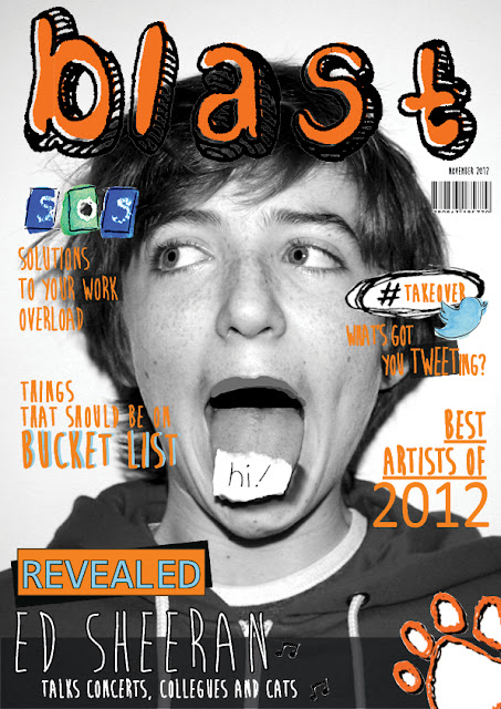
| Finished front cover |
|
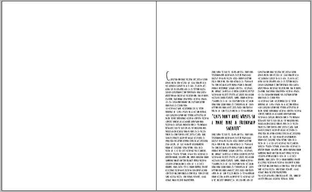
Finished double page spread
|


