One piece of work that was influenced by an artist was my small press comic done in the style of John Porcellino. Porcellino uses a very simplistic fine line drawing style which looked effortless, yet when I tried to imitate this I realised that a lot of thought, planning and skill was used to create his minimalist mini-comics.
This piece of work was unlike anything I had done before at this point as it was entirely dependent hand-drawn elements (both drawing and writing). This meant I had to really push myself as drawing is not my strongest feature. Also, I had to do lots of pencil sketches at first to get the general 'gist' of the style. By doing this project I developed my drawing skills, both in planning and then just 'going for it' when I had a better grasp. Additionally, it helped me to experiment with minimalism, and so, I learnt how if done effectively, it can look really good; giving me an alternative style to approach future pieces of work.

A piece where I used experimentation
I used a lot of experimentation when creating my sketchbook manual. For example, the whole project was a combination of hand-drawn and computer generated images. Even after scanning my own pictures into Photoshop, I continued to experiment with colouring, layout and rotation. The risks that I took was to create blocks on colour that roughly outlined the images, as opposed to having a neat colour fill. This was a change for me as normally I prefer to have very precise work, but this encouraged me to embrace the hand-drawn, rough yet still professional looking, style. Below you can see the colours I used; the scissors in particular have the colour spilling over the lines.
I developed this piece of work by taking my original iconography and creating a pattern with it. Above you can see the finished product with colour too. I linked the needle and thread on top of each other to further emphasise the techniques used within making the sketchbook, so the pattern reflected the content more.
Limitations of using colour in blocks as I did was that if you were to use it too often on one piece of work the overall effectiveness would be lost. Also, the circles could distract away from the image that they are there to accentuate.
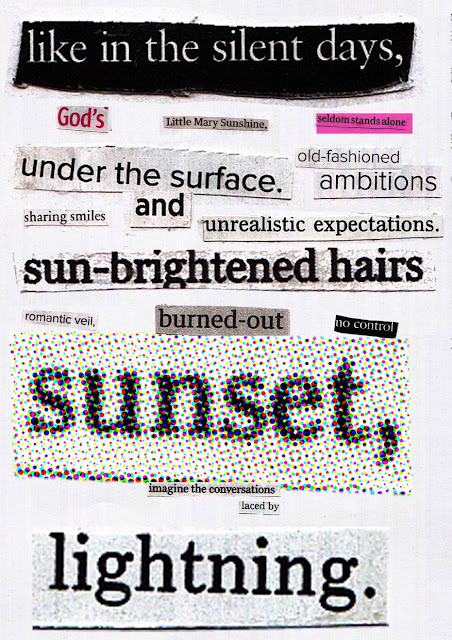
One piece that I refined over time was my Cut n Paste project. Initially my work was very safe and symmetrical; nothing really stood out off the page. To make the piece have more impact I needed to change the finished appearance of the poems. The layout in particular needed to be re-arranged so that there was more interest, and eye-catching features. To improve on this and make the finished product more aesthetically pleasing, I altered the size of the text a lot more dramatically, so there was a bigger contrast. Also, for some of the words I applied colour and filters to make them even more prominent on the page.
Before:
After:

Discuss the brief
The brief for my final piece was to create a magazine front cover and double page spread for a sixth form college, meaning that the target audience was teenage males and females. Our content and cover lines then had to reflect this, for example using subjects such as music, health, study, relationships ect.
Once given this brief I went about brainstorming ideas on things such as themes, coverlines and mastheads to help me gain some sort of direction as to where I wanted my magazine to go. Also, as part of my research I created moodboards of typography and magazine covers. I then did some drafting of initial ideas and experimentation of backgrounds and typography (including using wax crayons, ink, newspaper cutouts and watercolours). As part of the hand-drawn element I also drew and inked some iconography which I could scan into the computer and place on the pages. The final stage before actually creating the font page and double page spread was further experiments. Once I had an idea of what I was doing for my final piece, I then tried multiple processes to create this. For example, I tried using layer masks to add a new creative edge to already existing images and I also took my own photographs and photoshopped then onto the cover, as opposed to using pictures off the internet.
Final piece
My final piece was the magazine cover and double page spread I did on Ed Sheeran. One thing that I felt went well on this project was the continuity that the finished piece exhibited. I managed to create a relevant colour scheme (orange being the most-linked colour to Sheeran) and then maintain this throughout the cover. I felt this was important because after researching other magazines such as Elle and More, it was evident that there needed to be one prominent colour that ran throughout, their 'trademark' colour as it were. Below you can see the green colour scheme in More magazine, and the orange in my own.

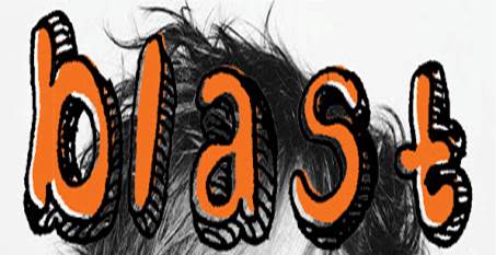
On the whole I liked my final piece as it combined both hand-drawn and computer generated aspects. With that said, if I could change one thing I would change my header (BLAST). While it successfully incorporates the hand-drawn element of the brief, I feel that personally the finished product doesn't look as professional as it could do. With it being the masthead I think it would be better if it had a 'cleaner' and smooth finish, as this is the most important selling point for the magazine. Below is the header I used:

To improve this in the future I would use a finer pen when drawing the typeface initially, because I think the thick lines of the drop shadow look less sophisticated. This simple alteration would mean that the header would look more precise and subtle in terms of hand drawn elements.


